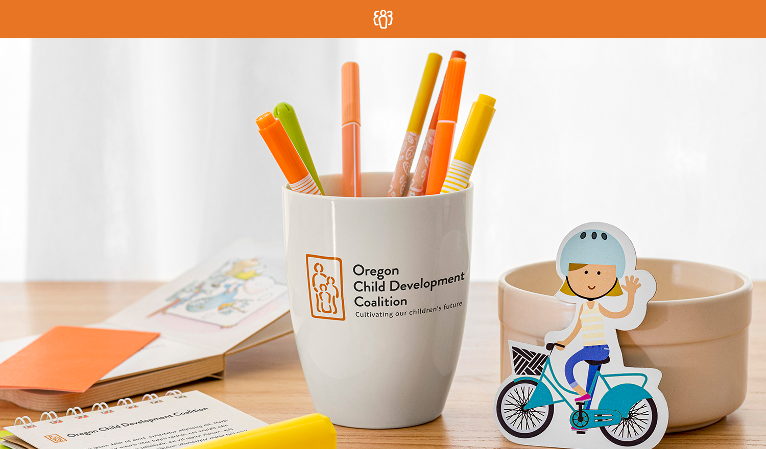
Oregon Child Development Coalition
In partnership with Dapper Digital
WHAT WE DID
1) Brand Discovery
2) Logo & Brand Design
3) Brand Guidelines
4) Website Design (including ADA compliance)
Oregon Child Development Coalition
In partnership with Dapper Digital
WHAT WE DID
1) Brand Discovery
2) Logo & Brand Design
3) Brand Guidelines
4) Website Design (including ADA compliance)
Logo & Brand Design
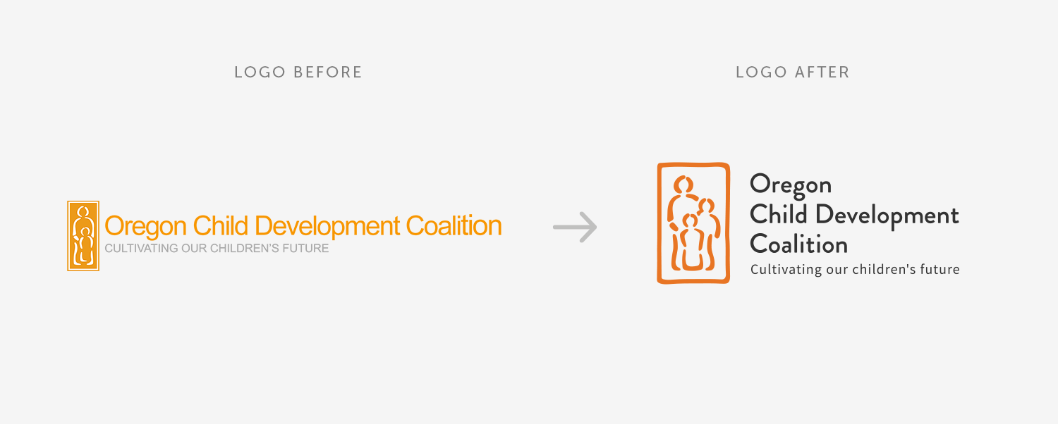
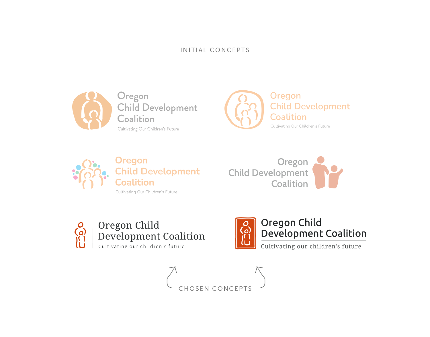
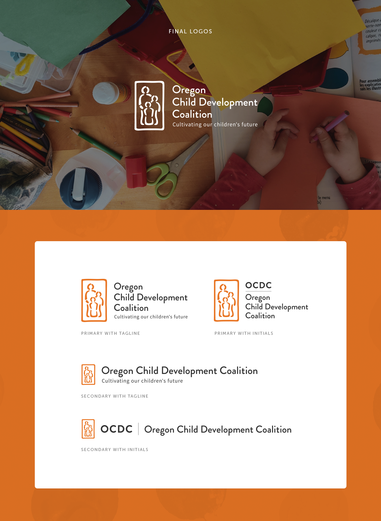
In designing the new logo for the Oregon Child Development Coalition, we drew inspiration from the organization's mission of nurturing children and families, and leaned on the established brand history as to not transform the mark past the point of visual consistency. Specific requests from the client included updating the colors for ADA compliance, and adding a third figure to the family depicted. The bright and playful colors reflect the joy and energy of childhood, while the use of overlapping shapes represent the interconnectedness of the community. The final result is a unique and scalable logo that effectively communicates the organization's values and purpose.

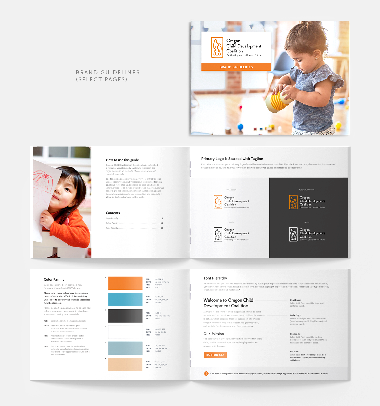
Brand Guidelines
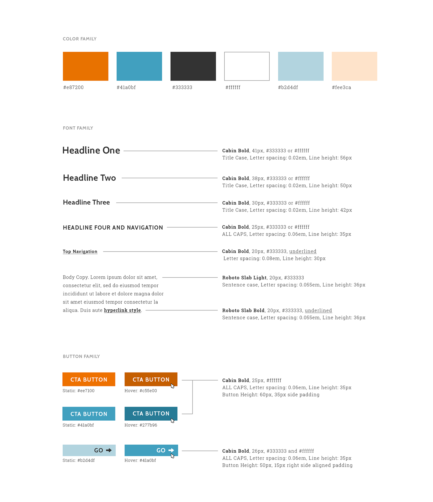
Brand guidelines for the Oregon Child Development Coalition serve as a comprehensive resource that outlines the organization's visual identity and messaging standards. The purpose of these guidelines is to ensure consistency in how the organization presents itself across all media channels—including print, digital, and social. By following these guidelines, the organization can build and maintain a strong and distinctive brand that effectively communicates its mission and values to its audience. These guidelines cover everything from logo usage, color palettes, typography, and tone of voice, providing a clear framework for all branding and communication efforts.
website design
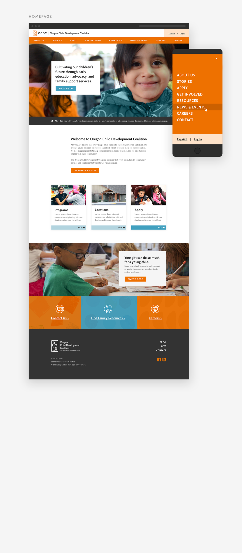
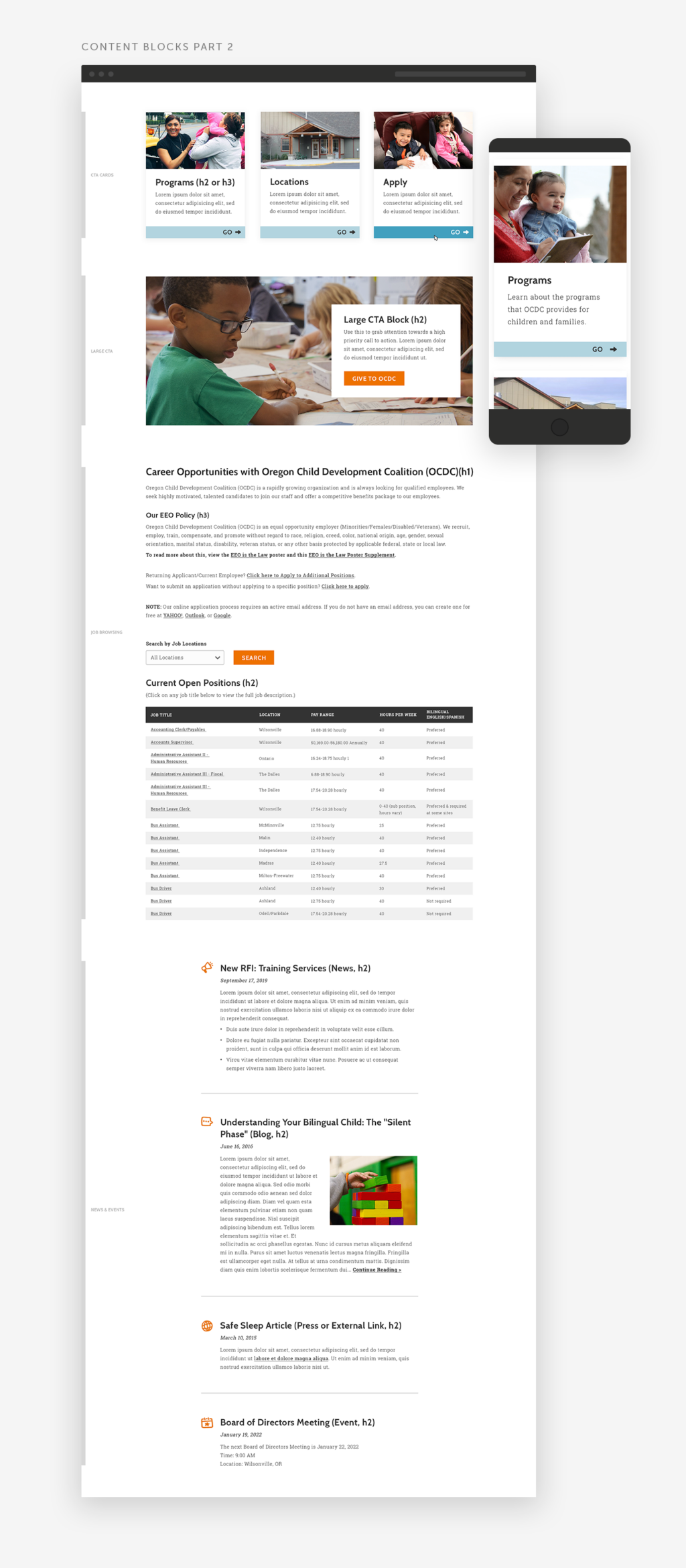
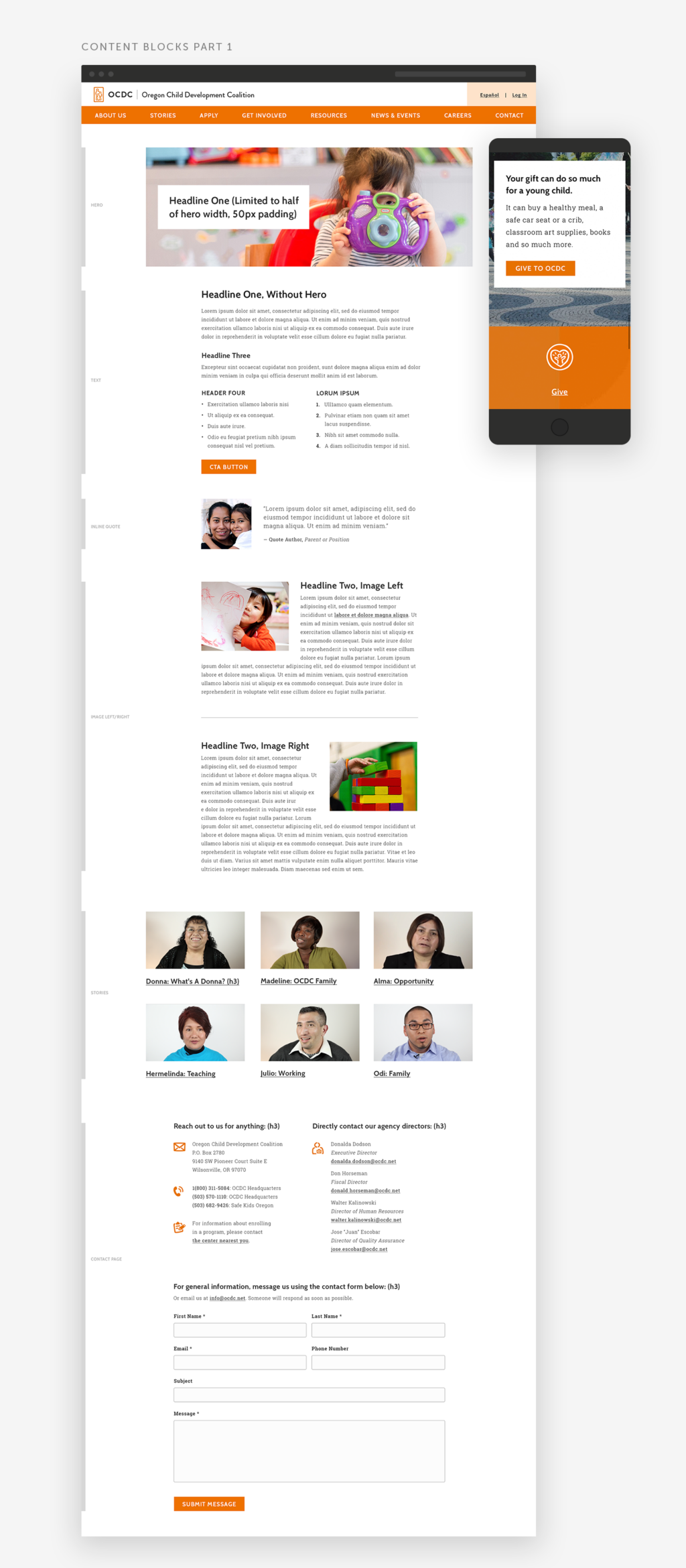
Effective website design is crucial for any organization. A well-designed website engages readers, is easy to navigate, and is accessible to all users. It should also reflect the brand's identity and messaging—aligning with the overall creative strategy.
For OCDC’s website, we prioritized a purposeful user experience that easily navigates readers to key pages and information. The site’s design reflects the newly developed brand—bright, colorful, and trustworthy. OCDC’s website is fully ADA compliant and in alignment with WCAG 2.1 accessibility standards. To make this happen, we paid close attention to using clear type hierarchy that’s easy to understand, font sizes large enough for anyone to read, and color choices that provide sufficient contrast.
